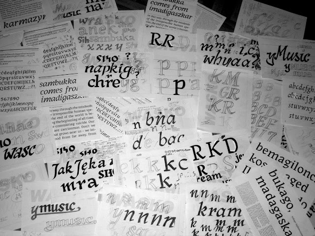
In shortcut | I work with typefaces so they are part of my just like jogging. Sambukka is my first serious approach to typedesign and it mostly inspired by the sepcific look of Hebrew and also by the awarness that there still is a gap in typedesign /about this later, hebrew research in progress since year/.
Basicly, Sambukka was designed to serve as typeface for short prosaic forms and poetry, however it can as well work as typeface for identities.
At the firs gaze Sambukka looks slightly complicated: like unsolved riddle. And this is the result of the following:
first | I like things and designs to be clear, simple and easy, so the more complicated principles I introduced into Sambukka the more riddles I have to solve /feminine way of thinking/
second | the more complicated I get, the more I learn and try. I also test myself in taking risks and making radical decisions quickly enough to make progress
third | I kinda love Preissig/soon about design process and some sketches/
tak to już jest
this is how it is


